Showing posts with label data. Show all posts
Showing posts with label data. Show all posts
Part 1 of Cloud Automatic Machine Learning (AML) Tools My Lessons Learned: Google's BigQuery ML
Fun with pipelines and irises (python, sklearn, pipeline, categorical, xgboost)
Following is demonstration of a trick I've learned using pipelines with scikit-learn. Your machine-learning development flow probably looks something like this:
- explore data
- subset features
- transform features
- calculate new features
- split data into train-validate-test
- model fit using sklearn estimators
- repeat
In the past, I would functionalize each step above and think my code style was pretty good. Lately, I've been using scikit-learn pipelines as even better code style, templating the function calls! You may want to add/switch out different transformers, or add/switch out different models as you learn more - which you will!
Pipelines enable cleaner switching in/out of transforms and models, all you have to do is change out the pipes in your pipeline. Pipelines make your machine-learning workflow reproducible and easier to share with teammates. The notebook itself is attached here. Below I explain how it works.
|
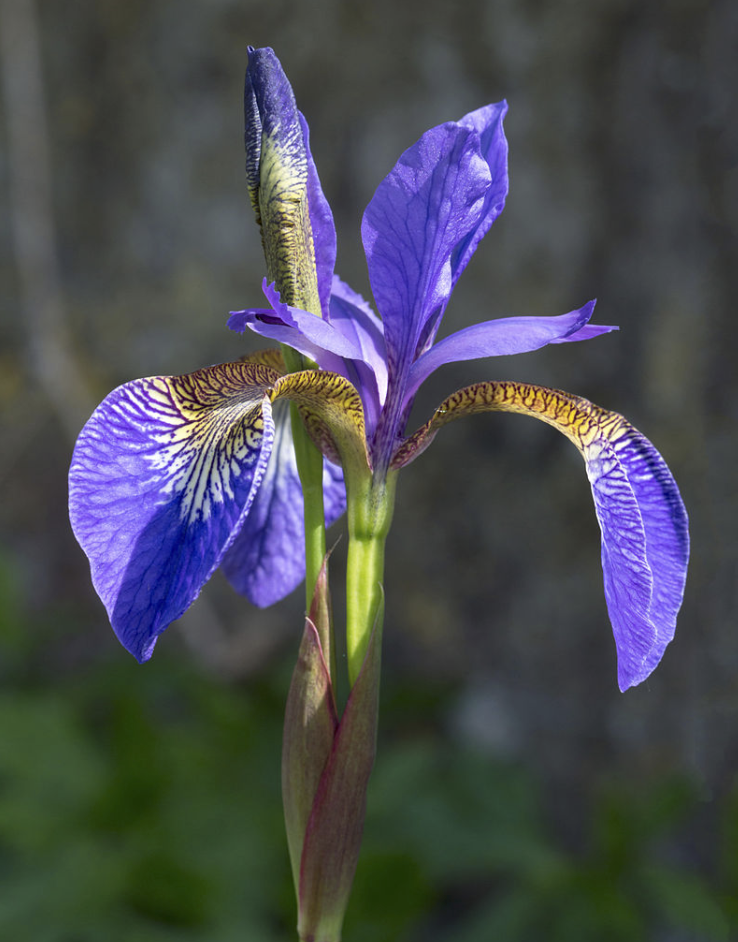
Demonstration below from Jupyter notebook uses the classic, well-known iris dataset. Given features of irises (the Greek rainbow goddess flower), the goal is to classify samples according to 3 iris species. (apparently Fisher in 1936 didn't know about Iris douglasiana, a 4th species native to Northern CA region.) First, we'll load the necessary libraries and load the data. |
 |
import sys
print('Python: {}'.format(sys.version))
import numpy as np
print('numpy: {}'.format(np.__version__))
import pandas as pd
print('pandas: {}'.format(pd.__version__))
import matplotlib
import matplotlib.pyplot as plt
%matplotlib inline
import seaborn as sns
import sklearn
print('sklearn: {}'.format(sklearn.__version__))

# Read dataset from URL
url = "https://archive.ics.uci.edu/ml/machine-learning-databases/iris/iris.data"
names = ['sepal-length', 'sepal-width', 'petal-length', 'petal-width', 'class']
iris = pd.read_csv(url, names=names)

# Randomize the rows to help prevent sampling bias later when you split train/val/test
iris = iris.reindex(np.random.permutation(iris.index))

# Convert target column to pandas built-in type category
iris["class"] = iris["class"].astype("category")

# Check dataset
print("DATA SIZE")
print(iris.shape)
print("HEAD 2 ROWS:")
print(iris.head(2))
print("SUMMARY STATS:")
print(iris.describe())
Python: 3.6.1 (v3.6.1:69c0db5050, Mar 21 2017, 01:21:04)
[GCC 4.2.1 (Apple Inc. build 5666) (dot 3)]
numpy: 1.14.5
pandas: 0.23.1
sklearn: 0.19.1

DATA SIZE
(150, 5)
HEAD 2 ROWS:
   sepal-length   sepal-width   petal-length   petal-width        class
0           5.1           3.5            1.4           0.2  Iris-setosa
1           4.9           3.0            1.4           0.2  Iris-setosa
SUMMARY STATS:
       sepal-length   sepal-width   petal-length   petal-width
count    150.000000    150.000000     150.000000    150.000000
mean       5.843333      3.054000       3.758667      1.198667
std        0.828066      0.433594       1.764420      0.763161
min        4.300000      2.000000       1.000000      0.100000
25%        5.100000      2.800000       1.600000      0.300000
50%        5.800000      3.000000       4.350000      1.300000
75%        6.400000      3.300000       5.100000      1.800000
max        7.900000      4.400000       6.900000      2.500000
Explore the data by visualizing features, x's, compared to labels, y's. We'll make a segmented bar chart and check correlations. Intuition about the data will help us "vet" the machine learning results later.
# Matplotlib
fig, axes = plt.subplots(nrows=1, ncols=2, figsize=(12,3))

# Pandas segmented bar chart of y-value means by feature X
mytable = iris.groupby(by=['class'])['sepal-length','sepal-width','petal-length','petal-width'].mean()
mytable.plot.bar(ax=axes[0]);
x_axis = axes[0].axes.get_xaxis()
x_label = x_axis.get_label()
x_label.set_visible(False)
axes[0].tick_params(axis = 'x', labelsize = 12, labelrotation='default')

# Seaborn box plot numeric x-variables
temp = iris.select_dtypes(include=[np.number])
axes = sns.boxplot(data=temp, ax=axes[1]);

# Print out pandas profile report
pandas_profiling.ProfileReport(iris)
 | |
 |
|
 |
 |
What you should notice: 1) top left chart shows petal-length and petal-width are the most segmenting features between classes (most difference in values), so expect these to be top feature candidates in your classification model, 2) top right chart shows more variance in petal-length than petal-width, 3) middle chart shows equal sampling of 3 classes, 4) correlations show petal-length and petal-width are the most highly correlated (darkest red quadrants) as well as sepal-length.
Certain estimators such as XGBoost require only numeric inputs. This means we have to create dummy numbers from categorical targets. If the categorical data are in the features, we have to additionally use a process called "one-hot encoding". What's tricky about one-hot-encoded variables is you're actually changing the shape of your dataframe, which usually can't be handled in a single pipeline. One trick I've learned is to split up the processing into 2 Stages: Processing and Modeling, each with their own Pipelines. Here is a general pipeline programming flow that works for me and took a while (for me) to figure out.
PROCESSING STAGE
1. Define pipeline to transform categorical variables
2. Define pipeline to transform numeric variables
3. Define pipeline to transform boolean variables
4. Feature_pipeline = Pipeline([
        (FeatureUnion(transformer_list=[
         (transform_categoricals)
         (transform_numerics)
                (transform_booleans)
                ])  #end FeatureUnion
 ])  #end Feature_pipeline
5. Target_pipeline = Pipeline([
        (FeatureUnion(transformer_list=[
         (transform_categoricals)
         (transform_numerics)
                (transform_booleans)
                ])  #end FeatureUnion
 ])  #end Target_pipeline

SPLIT DATA INTRO TRAIN-VALIDATE-TEST
X_train, X_validate, X_test = Feature_pipeline.transform(df_features)
y_train, y_validate, y_test = Target_pipeline.transform(df_target)

MODELING STAGE
1. select X_train, y_train column you want, e.g. only select dummy-encoded columns leaving out original categorical columns
2. Define pipeline to transform and fit X,y which is default behavior of pipelines
model_pipeline = Pipeline([
 (better form is put your column selection into transform fn here)
        (model_1_of_ensemble)
        (model_2_of_ensemble)
        (more models... )
 ])  #end pipeline2
6. model_pipeline.fit_transform(X_train, y_train)
# STEP1: Define processing pipelines

# Encode categorical column
pd.options.mode.chained_assignment = None  # default='warn' due to chaining fn calling fn
from sklearn.preprocessing import LabelEncoder, OneHotEncoder
def encode_category(data) :
    data_le = data
    le = LabelEncoder()
    for col in range(0,len(data.columns)):
        # subset just a categorical column
        name = data.columns[col] + '_encoded'
        data_le[name] = le.fit_transform(data.iloc[:,col])
    return data_le


# Define custom sklearn transformer for categorical variables
from sklearn.base import BaseEstimator, TransformerMixin
class TransformCategoricals(BaseEstimator, TransformerMixin):
    """Prepares categorical features from iris data set.
    Args:
       X,y as numpy arrays
    Returns:
       X numpy array transformed, y as original numpy array
    """
    def fit(self, X, y=None):
        return self

    def transform(self, X):
        # Encode categorical variable "class"
        iris_le = encode_category(X)
        return iris_le


# define pipeline to transform just categoric columns
pipeline_categorical = Pipeline([
    ("select_categorical", TypeSelector(dtype='category'))
    , ("encode", TransformCategoricals())
    # one-hot would go here...
    # add/replace more transforms here...
])

# define pipeline to transform just numeric columns
pipeline_numeric = Pipeline([
    ("select_numeric", TypeSelector(dtype='number'))
    # add/replace more transforms here...
])

# Putting it together, define Feature_pipeline, in case of mixed data types in features
from sklearn.pipeline import Pipeline, FeatureUnion
Feature_pipeline = Pipeline([
    ('union', FeatureUnion([
        ('categorical', Pipeline([
            ("select_categorical", TypeSelector(dtype='category'))
            , ("encode", TransformCategoricals())
            # add/replace one hot transform here...
        ]))
        , ('numerical', Pipeline([
            ("select_numeric", TypeSelector(dtype='number'))
            # add/replace more numeric transforms here...
        ]))
    ]))  #end FeatureUnion
    #, ("debug", Debug())  #prints head() for debugging
    ])
# SPLIT DATA INTRO TRAIN-VALIDATE-TEST
# Choose the first 105 (out of 150, 70%) examples for training.
# X_train could call Feature_pipeline, but we only have 1 datatype in iris example, which is numerics
X_train = pipeline_numeric.transform(iris.head(105))
y_train = pipeline_categorical.transform(iris.head(105))

# Choose the last 45 (out of 150, 30%) examples for validation.
X_test = pipeline_numeric.transform(iris.tail(45))
y_test = pipeline_categorical.transform(iris.tail(45))

# Double-check that we've done the right thing.
print("Training examples summary:")
print(pd.concat([X_train,y_train], axis=1).describe())
print("Validation examples summary:")
print(pd.concat([X_test,y_test], axis=1).describe())
Training examples summary:
       sepal-length  sepal-width  petal-length  petal-width  class_encoded
count    105.000000   105.000000    105.000000   105.000000     105.000000
mean       5.742857     3.062857      3.576190     1.139048       0.933333
std        0.805970     0.426808      1.742651     0.765795       0.823532
min        4.300000     2.000000      1.000000     0.100000       0.000000
25%        5.100000     2.800000      1.500000     0.300000       0.000000
50%        5.700000     3.000000      4.200000     1.300000       1.000000
75%        6.400000     3.300000      5.000000     1.800000       2.000000
max        7.900000     4.400000      6.600000     2.500000       2.000000
Validation examples summary:
       sepal-length  sepal-width  petal-length  petal-width  class_encoded
count     45.000000    45.000000     45.000000    45.000000      45.000000
mean       6.077778     3.033333      4.184444     1.337778       1.155556
std        0.840424     0.453271      1.760547     0.746899       0.796457
min        4.400000     2.200000      1.200000     0.100000       0.000000
25%        5.500000     2.800000      3.000000     1.000000       1.000000
50%        6.200000     3.000000      4.700000     1.500000       1.000000
75%        6.600000     3.300000      5.500000     1.800000       2.000000
max        7.700000     4.200000      6.900000     2.500000       2.000000
Now we're ready for the modeling stage.
# MODELING STAGE
# drop the original categorical class, keep just the encoded class
y_train = y_train['class_encoded']
y_test = y_test['class_encoded']

# set seed
seed = 123

# Try XGB classifier
from xgboost.sklearn import XGBClassifier
model_pipeline = Pipeline([
    ('XGB', XGBClassifier(seed=seed))
])

# fit the model pipeline
model_pipeline.fit(X_train, y_train)
Pipeline(memory=None,
     steps=[('XGB', XGBClassifier(base_score=0.5, booster='gbtree', colsample_bylevel=1,
       colsample_bytree=1, gamma=0, learning_rate=0.1, max_delta_step=0,
       max_depth=3, min_child_weight=1, missing=None, n_estimators=100,
       n_jobs=1, nthread=None, objective='multi:softprob', random_state=0,
       reg_alpha=0, reg_lambda=1, scale_pos_weight=1, seed=123,
       silent=True, subsample=1))])
# make predictions with test data
y_pred = model_pipeline.predict(X_test)
predictions = [round(value) for value in y_pred]

# do a quick evaluation of prediction
accuracy = accuracy_score(y_test, predictions)
print("Accuracy: %.2f%%" % (accuracy * 100.0))
print(classification_report(y_test, predictions))
Accuracy: 91.11%
             precision    recall  f1-score   support

          0       1.00      1.00      1.00        11
          1       0.93      0.81      0.87        16
          2       0.85      0.94      0.89        18

avg / total       0.91      0.91      0.91        45
Try a different model, easy!
# define a simple model pipeline
model_pipeline = Pipeline([
    #('XGB', XGBClassifier(seed=seed))
    ('LDA', LinearDiscriminantAnalysis(seed=seed))
])

# fit the model pipeline
model_pipeline.fit(X_train, y_train)
Pipeline(memory=None,
     steps=[('LDA', LinearDiscriminantAnalysis(n_components=None, priors=None, shrinkage=None,
              solver='svd', store_covariance=False, tol=0.0001))])
# make predictions with test data
y_pred = model_pipeline.predict(X_test)
predictions = [round(value) for value in y_pred]

# do a quick evaluation of prediction
accuracy = accuracy_score(y_test, predictions)
print("Accuracy: %.2f%%" % (accuracy * 100.0))
print(classification_report(y_test, predictions))
Accuracy: 97.78%
             precision    recall  f1-score   support

          0       1.00      1.00      1.00        11
          1       0.94      1.00      0.97        16
          2       1.00      0.94      0.97        18

avg / total       0.98      0.98      0.98        45
Setting up the pipelines might seem like a lot for just the iris, but now you have the process down. Now it will be easier to try out different transformers or model estimators.
NOTE TO SELF TODO: write Part2 of this blog article! Next up, I'll plug in a bunch of different model estimators, including non-scikit-learn such as Google's TensorFlow, and talk about model evaluation... Hint: I recently discovered automatic grid search and lime ...!
Volunteering as a Data Science Hackathon leader
TODO - I know I need to update my blog about what a typical Data Science Hackathon is like. I led a team of approx 15 Bay Area data scientists to do a data project for a nonprofit Organization during a weekend. Late Saturday night, besides being the project manager, I decided to also get my own hands dirty and here is result.


Local Utilities Mapping Data Project
Last time I volunteered as a DataKind Visualization judge for a CivicData challenge. This time, I volunteered using an Atlassian Gives Back day off work, to figure out how to tag poles and create a map for my community utilities undergrounding project. The utility project was for Mendocino County, a remote location near the Pacific Ocean. The town I needed to map was not within any cell phone coverage. As a volunteer citizen with only a little bit of free time, I learned that having the right tools makes this kind of project easy and fun!
Prepared to Gather my Geodata
I already had a field geotagging device in my pocket - my smart phone! As long as you have allowed Location services, even without coverage from a cell phone provider, even when both Apple and Google map apps won't work anymore, your smart phone knows your location within 1-3 meters accuracy! Kind of scary, but proves useful for gathering data.
My first step was to decide what data I wanted to gather and put it in a survey form. The survey form would be deployed to a mobile device so I could record my data out in the field. Here is what I wanted to collect.
 To the rescue came Open Data Kit! Open Data Kit was easy to use, a lot like creating forms in Google Drive. The xml file can be imported directly into the ODK mobile app using an external SD drive without having to publish it publicly through appengine. After you collect all your data on your smartphone, you can import the whole kml file directly into Google Earth and/or Google Fusion table, hosted in Google's cloud infrastructure. The benefit to putting your data in Google Fusion is it stays there in case your phone memory gets wiped (especially my iPhone gets wiped frequently) or you change computers and lose track of where you put the data. You can import Google Fusion table directly into Google Earth too. This also helps with reproducible results, you can just hand your data to someone else later and let them visualize it. I loved the ease of conducting a Geodata project using Open Data Kit! The only drawback is mobile deployment only works for Android users.
For iPhone users, I chose Motion-X GPS. It lets you record all the above data including linked photos. I also liked the feature that lets you give permission to view your location to someone you think will stay within wifi or service coverage, so they can see your blue dot moving around and be reassured even when you're out of calling range. The disadvantage for iPhone users, is they don't let you download the whole database, you have email yourself each point as a .gpx file, then upload each .gpx point directly into Google Earth, manually add the photos, save "My Place" as .kmz file, load the .kmz files into Google Earth (described next) and update your Google Code database from there). Whew, a lot more work for iPhone users than for Android users!
Gathered my Geodata - and found a mushroom!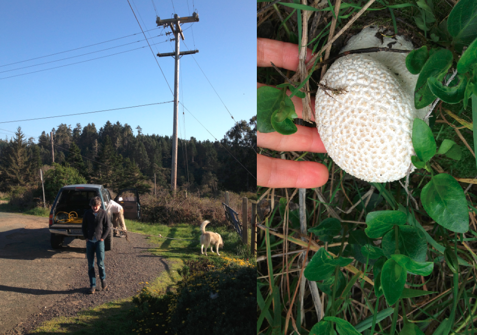
GIS Stackexchange was good for random questions I still had, such as how to check a phone's GPS accuracy: if you see 6 decimal places listed, your phone is probably within the prerequisite 5 decimal places for 1-3 meter accuracy. Walk around and check that location readings change as expected. My location display had 6 digits.
Before leaving the house, pre-load the area where you know you'll be into Google Maps and iPhone apps. Map apps will not load in the field without cell phone coverage.
Optional: borrow a neighbor's dog (if you don't have your own) for field trip.
Now get out, enjoy nature and your day off. One place near a pole near a creek, I found a huge edible mushroom that I'd never seen before. I took it later to a local mushroom expert, Alison Gardner, author of Wild Mushroom Cookbook, which is how I found out it was a Western Giant Puffball or Calvatia booniana.
Mapped my Geodata
Because of the breadth of its maps from satellite to street view, I chose to use Google Earth. Here are a few tips I learned:
My Android ODK data was automatically uploaded to Google Fusion as well as I could download entire kml file at once. For iPhone Motion-X data, I had to transfer every single tagged location individually and upload one at a time to Google Earth.
kmz, kml, or gpx format stores location in decimal form, independent of how the app displays the location. I found it reassuring in my mobile apps to view angular notations with separate latitude in DD° MM' SS" N|S and longitude in DD°MM' SS" W|E. Save-as .kmz for internal working since it's more space-efficient. Save-as .kml for final maps to share since that's more standard format.
Because of the 1-3 meter inaccuracy, I needed to adjust the location slightly in Google Earth using visual cues. The most accurate is to use aerial view in Google Earth, looking straight down as perpendicular as you can. Use the photos you took from field with landmarks you can see from Google Earth to more precisely line up your tagged item. Use the "man" and Street View to also help verify.
To suppress text labels: In your left-hand menu, click a Place > right-click Properties > Style > Label set opacity to 0 (zero). Maybe you'll figure out a better way, but the "name" field turns automatically into a "label" and clutters up the look of the map unless you suppress it.
To link your own photos: In your left-hand menu, click a Place > right-click Properties > Add pictures you took of that location. What worked easiest for me: load all my images to Google Drive and use the Google Drive URL to link my photos per location.
I added layers to my Google Earth map. I asked the cartographer at Mendocino County Planning for .pdf property lines for the area. I also asked a few large property owners and the original "company town" owners for more details such as EPA hazard spots and underground water pipes. I followed these overlay instructions to add public record layers.
To add a custom legend, I followed the these legends instructions, required a small amount of kml editing.

Shared my Map
The easiest is to share the .kml file with your public official with instructions how to download and use Google Earth, job done! Here are instructions I gave with my file and I got feedback (County Supervisor and PG&E manager) were able to see all the details.
Almost done. PG&E and AT&T back office required autocad format, not modern kml. To convert kml to dxf I used Google App Engine KML Tools. I don't own autocad so I couldn't view it. The County told me I saved them $70K, which is what they paid the last mapping company to create the last autocad maps for them. So with 1 day off work, I saved my County both money and time!
Strangely, Google's efforts to make maps more social means I now can't share this map with general public. A few months ago, I was able to go through 7-step contortion to create a "Classic Map". But now I can only create maps using "new Google maps engine lite". So for now, this is the only part of my volunteer mission that failed. But everything else worked!
Prepared to Gather my Geodata
I already had a field geotagging device in my pocket - my smart phone! As long as you have allowed Location services, even without coverage from a cell phone provider, even when both Apple and Google map apps won't work anymore, your smart phone knows your location within 1-3 meters accuracy! Kind of scary, but proves useful for gathering data.
My first step was to decide what data I wanted to gather and put it in a survey form. The survey form would be deployed to a mobile device so I could record my data out in the field. Here is what I wanted to collect.
- location name (I made up a short naming system before I left my house)
- text description for notes
- location (note: you don't have to worry how the app displays location, the app will convert to decimal and create kml (or kmz or gpx) file)
- pole # if exists
- pole owner (for this town either PG&E or AT&T)
- photos (as many as you want) linked to that location

For iPhone users, I chose Motion-X GPS. It lets you record all the above data including linked photos. I also liked the feature that lets you give permission to view your location to someone you think will stay within wifi or service coverage, so they can see your blue dot moving around and be reassured even when you're out of calling range. The disadvantage for iPhone users, is they don't let you download the whole database, you have email yourself each point as a .gpx file, then upload each .gpx point directly into Google Earth, manually add the photos, save "My Place" as .kmz file, load the .kmz files into Google Earth (described next) and update your Google Code database from there). Whew, a lot more work for iPhone users than for Android users!
Gathered my Geodata - and found a mushroom!
The night before my field trip, I charged my smartphones, charged external battery (I'm using Anker), and made a few test geotags. I decided to try gathering data on both iPhone and Android to test out how the whole process works with either kind of phone.
Because of the breadth of its maps from satellite to street view, I chose to use Google Earth. Here are a few tips I learned:

Shared my Map
The easiest is to share the .kml file with your public official with instructions how to download and use Google Earth, job done! Here are instructions I gave with my file and I got feedback (County Supervisor and PG&E manager) were able to see all the details.
-
1. Download Google Earth
http://www.google.com/earth/download/ge/agree.html
2. Download the attached .kml file
3. Open the .kml file using Google Earth - wait for Google Earth to finish its zooming
4. Close the Start-up Tip window
5. Use the +/- slider on right-hand-side to zoom in/out
6. Double-click in the map on a pole you are interested in viewing
7. You will be taken to street view. From here, you can zoom around street view to look at poles near roads up close
8. If there is a picture attached, it will be linked as URL to pop-up info about the pole
9. To go back to Google Earth, click "Exit Street View" in box on top right
Almost done. PG&E and AT&T back office required autocad format, not modern kml. To convert kml to dxf I used Google App Engine KML Tools. I don't own autocad so I couldn't view it. The County told me I saved them $70K, which is what they paid the last mapping company to create the last autocad maps for them. So with 1 day off work, I saved my County both money and time!
Strangely, Google's efforts to make maps more social means I now can't share this map with general public. A few months ago, I was able to go through 7-step contortion to create a "Classic Map". But now I can only create maps using "new Google maps engine lite". So for now, this is the only part of my volunteer mission that failed. But everything else worked!
Analyzing DataSF.org data
Given I'm a data analyst by profession, it's time for me to post what I do for my day job. Most of my work is corporate, so unfortunately can't share those analyses here. But here's something I did in my free time, spent a few hours looking at the city of San Francisco's public data on datasf.org. From that website, I grabbed all the San Francisco Police Department historical incident records, 2003-2012, and loaded the .csv files into R and Tableau. The raw data are logged police "incidents" or reported crimes, tagged by geo-location (cross-streets in neighborhoods but not specific addresses), time of day, category of crime, description, and resolution status. What I discovered could be titled "San Francisco Crime: urban myth vs. reality".
The first urban myth, one I've heard at Silicon Valley parties, is that "prostitution is a big problem in San Francisco". Actually it's not. Looking at crimes by category city-wide, year after year, the most common crimes are "Larceny" i.e. theft, "non-criminal", "other", and "assault". Prostitution isn't even in the top 20 crime categories by frequency. Year over year, larceny remains the most frequent crime. Vehicle theft dropped from 3rd most frequent crime category back in 2003 to barely in the top 10 now. Overall crime has trended down (approx 3%/year). Diving in deeper, we see that the top crime months tend to be January, March, August and October. Also, top crime days of the week are Fridays and Wednesdays.


Another urban myth I've heard is that "homicide happens more often wee hours night and morning than when regular people are out". Untrue. Again, the data shows homicide happens all hours, especially 11am and early evenings 6-8pm. It almost looks like murder happens the most just before lunch and dinner! Here I've downloaded homicide incidents from the entire Bay Area (including Oakland) for the last 6 months.

What about neighborhoods, you ask? Now it seems, some rumours you hear are true. While city-wide larceny is the main crime, once we delve into neighborhoods, we see distinct crime personalities. Most dramatic is the high proportion of "drug" crimes in the Tenderloin. Carjacking is high proportionally in Ingleside. But the Rincon Tower of crime here is larceny (or theft) in South of Market. There's almost twice as much theft happening in the Southern Police District (which includes the Ferry Building, Giants Ballpark, Caltrain station, and Folsom/11th night club area) compared to any other neighborhoods. While BayView, the notoriously "bad gangs" neighborhood, has almost as much violent crime (e.g. assault) as larceny, the astute eye will see that Mission and Southern have, by quantity, actually more assault than Bayview. The chart below is split into upper - crime category profiles per neighborhood over all years, and lower - per year frequencies of crimes per neighborhood. Overall Southern has stood tall in larceny all this time; while drugs in the 'loin peaked around 2008. It should be noted that police reporting districts are close but don't exactly correspond to the common names for local neighborhoods.

Southern has the most crime, closely followed by the Mission, but the Tenderloin followed by Mission have the highest resolution rates. This means if you report a crime in the Mission you are more likely to get a police resolution than if you report a crime in Richmond, for example. Maybe because drug incidents are more easily "booked" and resolved than other types of crimes?

Next, what's interesting is to look at correlations between types of crime. In the chart below, the size and darkness of the circles indicate high positive correlation, meaning those two crimes tend to happen together at the same times and places. Size and redness of the circles indicate high negative correlation, meaning they usually didn't happen at the same time or place. In the graphic below, the darkest biggest circles are on the diagonal since anything has correlation=1 with itself. The graph is symmetric, so you only need to look above or below the diagonal. Kidnapping and weapons appear highly correlated. Maybe that's expected? How about recovered vehicle with weapons and arson? Does it make sense that drugs are negatively correlated to runaways and vehicle theft? Maybe that's because runaways and car thieves don't go to the Tenderloin? Prostitution and Pornography appear to be focused, connected crimes. "Forcible sex" i.e. rape is correlated with assault, robbery, kidnapping, stolen property and trespass. Some crimes seem more broadly correlated with lots of other crimes. It's important to remember at this point that correlation has nothing to do with causation.

The next thing to do is plot crimes city-wide by time of day. This should show us crimes that are closely related by frequency and time but not necessarily location. We'd expect to see crimes that could travel show up here. Indeed paired crimes "warrants and drugs" that we saw in the correlations graph jump out again here. "Larceny and vehicle theft" is a pair we didn't see earlier though.

One visualization trick I've learned is to make a grid of pairwise X-Y line charts and look for straight lines - those are suspected fruitful regression variables. Looking at the grid of pairs, we can pick out the pairs "warrants and drugs" and "larceny and cartheft" like we found above. In addition, "larceny" and "warrants" look the most related to the most number of other crimes. Running step-wise regression on this dataset would be the best way to pick out even deeper patterns that our naked eyes can't see.

The next step would be to take some of these findings to the Police Department, and find out what the field experts say, and whether knowing such things could help guide the police where to focus their presence?
Next step beyond that, is find out how does San Francisco crime profile compare to other large cities? I suspect there will be overall trends in common as well as distinct differences city-by-city as we saw neighborhood-by-neighborhood.
The first urban myth, one I've heard at Silicon Valley parties, is that "prostitution is a big problem in San Francisco". Actually it's not. Looking at crimes by category city-wide, year after year, the most common crimes are "Larceny" i.e. theft, "non-criminal", "other", and "assault". Prostitution isn't even in the top 20 crime categories by frequency. Year over year, larceny remains the most frequent crime. Vehicle theft dropped from 3rd most frequent crime category back in 2003 to barely in the top 10 now. Overall crime has trended down (approx 3%/year). Diving in deeper, we see that the top crime months tend to be January, March, August and October. Also, top crime days of the week are Fridays and Wednesdays.


Another urban myth I've heard is that "homicide happens more often wee hours night and morning than when regular people are out". Untrue. Again, the data shows homicide happens all hours, especially 11am and early evenings 6-8pm. It almost looks like murder happens the most just before lunch and dinner! Here I've downloaded homicide incidents from the entire Bay Area (including Oakland) for the last 6 months.

What about neighborhoods, you ask? Now it seems, some rumours you hear are true. While city-wide larceny is the main crime, once we delve into neighborhoods, we see distinct crime personalities. Most dramatic is the high proportion of "drug" crimes in the Tenderloin. Carjacking is high proportionally in Ingleside. But the Rincon Tower of crime here is larceny (or theft) in South of Market. There's almost twice as much theft happening in the Southern Police District (which includes the Ferry Building, Giants Ballpark, Caltrain station, and Folsom/11th night club area) compared to any other neighborhoods. While BayView, the notoriously "bad gangs" neighborhood, has almost as much violent crime (e.g. assault) as larceny, the astute eye will see that Mission and Southern have, by quantity, actually more assault than Bayview. The chart below is split into upper - crime category profiles per neighborhood over all years, and lower - per year frequencies of crimes per neighborhood. Overall Southern has stood tall in larceny all this time; while drugs in the 'loin peaked around 2008. It should be noted that police reporting districts are close but don't exactly correspond to the common names for local neighborhoods.

Southern has the most crime, closely followed by the Mission, but the Tenderloin followed by Mission have the highest resolution rates. This means if you report a crime in the Mission you are more likely to get a police resolution than if you report a crime in Richmond, for example. Maybe because drug incidents are more easily "booked" and resolved than other types of crimes?

Next, what's interesting is to look at correlations between types of crime. In the chart below, the size and darkness of the circles indicate high positive correlation, meaning those two crimes tend to happen together at the same times and places. Size and redness of the circles indicate high negative correlation, meaning they usually didn't happen at the same time or place. In the graphic below, the darkest biggest circles are on the diagonal since anything has correlation=1 with itself. The graph is symmetric, so you only need to look above or below the diagonal. Kidnapping and weapons appear highly correlated. Maybe that's expected? How about recovered vehicle with weapons and arson? Does it make sense that drugs are negatively correlated to runaways and vehicle theft? Maybe that's because runaways and car thieves don't go to the Tenderloin? Prostitution and Pornography appear to be focused, connected crimes. "Forcible sex" i.e. rape is correlated with assault, robbery, kidnapping, stolen property and trespass. Some crimes seem more broadly correlated with lots of other crimes. It's important to remember at this point that correlation has nothing to do with causation.

The next thing to do is plot crimes city-wide by time of day. This should show us crimes that are closely related by frequency and time but not necessarily location. We'd expect to see crimes that could travel show up here. Indeed paired crimes "warrants and drugs" that we saw in the correlations graph jump out again here. "Larceny and vehicle theft" is a pair we didn't see earlier though.

One visualization trick I've learned is to make a grid of pairwise X-Y line charts and look for straight lines - those are suspected fruitful regression variables. Looking at the grid of pairs, we can pick out the pairs "warrants and drugs" and "larceny and cartheft" like we found above. In addition, "larceny" and "warrants" look the most related to the most number of other crimes. Running step-wise regression on this dataset would be the best way to pick out even deeper patterns that our naked eyes can't see.

The next step would be to take some of these findings to the Police Department, and find out what the field experts say, and whether knowing such things could help guide the police where to focus their presence?
Next step beyond that, is find out how does San Francisco crime profile compare to other large cities? I suspect there will be overall trends in common as well as distinct differences city-by-city as we saw neighborhood-by-neighborhood.
the "Mitochondrial Eve" of Zinfandel?
Breaking news in ampelography (the study of grape genetic origins and classifications): a new "Eve" of Zinfandel has been discovered! A Tribidrag leaf (existing only as a dried herbarium specimen in the Natural History Museum in Split, Croatia) also known as Pribidrag, is now identified as Crljenak Kastelanski (i.e. in Croation "the black grape of Kastel"). Historical documents trace the cultivation of Tribidrag in Croatia back to the beginning of the 15th century. See http://www.springerlink.com/content/b161077101100317.
Tribidrag supposedly comes from the Greek and means 'early grape' or 'July grape'. The Italian name 'Primitivo' also refers to its earliness relative to other grapes in the region. As I understand it, we have Tribidrag & Pribidrag now as the earliest synonyms for Italian Primitivo which is also a synonym for American Zinfandel. Plavac Mali is the result of crossing offspring of crossing Zinfandel and Dobricic, another Croatian variety.
In 2001, Carole Meredith published (together with Univ. of Zagreb collaborators Ivan Pejic and Edi Maletic) the finding that Crljenak Kastelanski is what we Americans call Zinfandel. See >http://www.actahort.org/books/603/603_34.htm and >http://www.amacad.org/publications/bulletin/winter2003/wine.pdf An interesting "insider note" from Carole Meredith about the usefulness of dried herbarium speciments on http://wineberserkers.com/forum/viewtopic.php?f=1&t=51255: "Yes, the Tribidrag DNA was extracted from the leaves of an herbarium specimen in the Natural History Museum in Split, Croatia. Herbarium specimens are representative examples of a particular plant that have been pressed and dried. They are quite dead. Dried leaf tissue can be a great source of high quality DNA. When my lab was analyzing grape varieties from other countries, we couldn't use fresh samples because the USDA plant quarantine regulations prohibit the importation of living grapevine tissue unless it goes through a quarantine station for disease testing. That takes 2 years! So we figured out how to chemically dry leaf samples using anhydrous calcium chloride. This was quite legal since the leaf tissue was no longer living. But the DNA was very well preserved."
In order to keep up with the times, I've added 2 new rows to my own grape varietals database: one for Tribidrag and another for Pribidrag linking them to Crljenak Kastelanski. The synonym Kratosija which was previously attached to Primitivo is now attached to Crljenak Kastelanski. http://www.factual.com/ts/FEQqRu
Please let me know if you hear of any other grape varieties I've missed, I would welcome the news!
Tribidrag supposedly comes from the Greek and means 'early grape' or 'July grape'. The Italian name 'Primitivo' also refers to its earliness relative to other grapes in the region. As I understand it, we have Tribidrag & Pribidrag now as the earliest synonyms for Italian Primitivo which is also a synonym for American Zinfandel. Plavac Mali is the result of crossing offspring of crossing Zinfandel and Dobricic, another Croatian variety.
In 2001, Carole Meredith published (together with Univ. of Zagreb collaborators Ivan Pejic and Edi Maletic) the finding that Crljenak Kastelanski is what we Americans call Zinfandel. See >http://www.actahort.org/books/603/603_34.htm and >http://www.amacad.org/publications/bulletin/winter2003/wine.pdf An interesting "insider note" from Carole Meredith about the usefulness of dried herbarium speciments on http://wineberserkers.com/forum/viewtopic.php?f=1&t=51255: "Yes, the Tribidrag DNA was extracted from the leaves of an herbarium specimen in the Natural History Museum in Split, Croatia. Herbarium specimens are representative examples of a particular plant that have been pressed and dried. They are quite dead. Dried leaf tissue can be a great source of high quality DNA. When my lab was analyzing grape varieties from other countries, we couldn't use fresh samples because the USDA plant quarantine regulations prohibit the importation of living grapevine tissue unless it goes through a quarantine station for disease testing. That takes 2 years! So we figured out how to chemically dry leaf samples using anhydrous calcium chloride. This was quite legal since the leaf tissue was no longer living. But the DNA was very well preserved."
In order to keep up with the times, I've added 2 new rows to my own grape varietals database: one for Tribidrag and another for Pribidrag linking them to Crljenak Kastelanski. The synonym Kratosija which was previously attached to Primitivo is now attached to Crljenak Kastelanski. http://www.factual.com/ts/FEQqRu
Please let me know if you hear of any other grape varieties I've missed, I would welcome the news!
# syllables used to describe wine is inversely proportional to the value of the wine

After Monday night's Muscardini Cellars tasting at the Secret Wine Shop, one reviewer left me this sheet of paper, which I found fascinating. According to this wine reviewer's self-referential definition of good value wines, Muscardini Cellars wines are good value since the reviewer gave very short word descriptions of the wines: "good nose", "tannin & struct", "balance", "best, yummy".
Last Monday, 20 people showed up to taste 6 different Michael Muscardini wines. Of the 20 people, 12 filled out their reviews and favorite rankings sheets.
| Lesson #1 about tastings is when you greet people, get them to sign your signup sheet, then hand them a score sheet & ask them to score the wines & give you any comments. That way you'll get more ratings results and handwriting clues if you need them. |
The results: 2008 Barbera won people's favorite wine 5 times! The 2009 barrel sample Zinfandel won 4 times. 2009 "Tesoro" won 2 x. The 2008 Sangiovese won 2 x. The 2009 Rosato won 1 x. One person voted a tie for favorite wine between the '08 Barbera, '09 Tesoro and '09 Zinfandel.
With this tasting, I paired a very smoky sausage with the 2008 Barbera. Everyone, except 1 person, said they loved the sausage with the wine. Interestingly the 2008 Barbera won this tasting as most people's favorite wine of the evening; usually it's the Zin that wins.
| Lesson #2 about tastings is food can make a big difference in how people perceive & rate a wine. Don't worry about getting the pairing perfect for everyone. Pairing is a matter of personal taste, so not everyone is going to love your choice but more people will love the wine. |
14,000 different wine grape varietals
I just uploaded the FAO/EU wine grape database, the French INRA wine grape database, and the USDA wine grape databases, combining them all into a big super table, embedded below. More than 14,000 rows! More than 14,000 different vitis vinifera varietals!
Some fun things to do in the table:
* Type "bourgogne" into the box labeled "Search within this table". Notice 93 different grapes exist in Burgundy! In wine classes, they always say there are just a handful. They probably say that to us to make things sound simple. In reality, a French AOC is defined by what grows there, the terroir. So in reality, Burgundy terroir could contain up to 93 different varietals!
* Clear your last search filter. Type "kastelan" into the box labeled "Search within this table". Click on Croatia with "?" next to it > Explain. Notice the disagreement. The FAO (United Nations) and EU think it is Primitivo (aka Zinfandel). But UCDavis has identified it as Croatian. So, even the experts don't always agree!
* Clear your last search filter. Type "malbec" into the box labeled "Search within this table". Click on France with "?" next to it > Explain. Notice the disagreement. The FAO (United Nations) and EU think it is American, maybe they think Malbec arrived in Argentina via the US. But UCDavis has identified it as French. So, again, even the experts don't always agree!
* Clear your last search filter. Type "Georgia" into the box labeled "Search within this table". Amazing, almost 600 different varieties! Look through the list of strange names you've probably never heard of that come from the original genetic Birthplace of Wine Grapes.
Another fun use of the data is to check how many teinturier varieties exist (grapes with red juice). According to the table, there are 83 different teinturier varieties! Most other sources only cite a handful, maybe 5 exist. Again, it seems like folklore has glossed over reality.
Some fun things to do in the table:
* Type "bourgogne" into the box labeled "Search within this table". Notice 93 different grapes exist in Burgundy! In wine classes, they always say there are just a handful. They probably say that to us to make things sound simple. In reality, a French AOC is defined by what grows there, the terroir. So in reality, Burgundy terroir could contain up to 93 different varietals!
* Clear your last search filter. Type "kastelan" into the box labeled "Search within this table". Click on Croatia with "?" next to it > Explain. Notice the disagreement. The FAO (United Nations) and EU think it is Primitivo (aka Zinfandel). But UCDavis has identified it as Croatian. So, even the experts don't always agree!
* Clear your last search filter. Type "malbec" into the box labeled "Search within this table". Click on France with "?" next to it > Explain. Notice the disagreement. The FAO (United Nations) and EU think it is American, maybe they think Malbec arrived in Argentina via the US. But UCDavis has identified it as French. So, again, even the experts don't always agree!
* Clear your last search filter. Type "Georgia" into the box labeled "Search within this table". Amazing, almost 600 different varieties! Look through the list of strange names you've probably never heard of that come from the original genetic Birthplace of Wine Grapes.
Another fun use of the data is to check how many teinturier varieties exist (grapes with red juice). According to the table, there are 83 different teinturier varieties! Most other sources only cite a handful, maybe 5 exist. Again, it seems like folklore has glossed over reality.
Latest US National Crush Report
Mashed USA Crush Statistics for top 6 States (CA, WA, OR, PA, VA, NY) from 2007 - 2009. CA, WA, OR stats go through 2009. I'm still waiting for PA, VA, NY 2009 updated crush reports. Source used: "crush reports" from http://www.nass.usda.gov.
California reports separately Raisin, Table, Red Wine, and White Wine grapes from 17 crush districts. Each district varies widely in the variety and price per ton. District 4 (Napa) receives the highest average price of $3,415 per ton. District 3 (Sonoma and Marin counties) receive the second highest price per ton $2,187.
The rest of the states don't have the breakdown by grape useage. After CA, Washington produced the next highest number of tons of grapes (156 thousand tons vs CA's 4 million tons).
A few interesting Varietal statistics stand out.
A few interesting Price statistics stand out.
Footnote+1: Some recognized teinturier varieties http://ngr.ucdavis.edu
1) Petit Bouschet (synonyms: ramon Teinturier, Bouschet de Bernard, Bouschet Petit, Petit Bouse, Pti Bushe, Tintinha),
2) Alicante Bouschet (synonyms: ramon Teinturier, Bouschet de Bernard, Bouschet Petit, Petit Bouse, Pti Bushe, Tintinha),
3) Rubired (CA hybrid of Alicante Ganzin and Tinta Cao (an AXR (Aramon crossed Rupestris (Aramon was a french root stock, rupestris is an American root stock, the two were crossed in France after the phylloxera epidemic)), synonyms: Calif 58, California S 8, Ruby-Red)
The rest of the states don't have the breakdown by grape useage. After CA, Washington produced the next highest number of tons of grapes (156 thousand tons vs CA's 4 million tons).
A few interesting Varietal statistics stand out.
- CA crushes more Rubired than Pinot Noir or Syrah. Second only to Merlot and more than all of Washington's wine grapes put together. Grown mainly in Central Valley, Rubired is one of a handful of teinturier varieties (footnote +1). Where is all that Rubired juice going? I've not seen it on red wine labels, except once at Wellington in Sonoma ("Noir de Noirs"). Supposedly it's mostly going to make juice concentrate (juice was 748K tons or 20% of 2008 crush). http://www.winebusiness.com/wbm/?go=getArticle&dataId=3565 Although googling around, I did find a link for natural grape color offered by SJVC/E&J Gallo. Curious. http://expoweb.ift.org/IFTExpo/ec/forms/attendee/index.aspx?content=vbooth&id=775
- Chardonnay is king, more was crushed in the US last year than any other varietal.
- Cabernet Sauvignon dropped by 25% year over year from 2007 to 2008, perhaps due to the expense involved in aging it?
- Sangiovese (mainly used for chianti-style wines) is a rare varietal in CA. You won't find it until you scroll about 1/3 of the way down the page. It's there between Carnelian & Princess (red seedless table grape). It's even below Virginia's total crush amount.
- Sagrantino is even rarer in CA (only 67 tons crushed last year).
A few interesting Price statistics stand out.
- Aleatico is the most highly priced wine, mostly grown in Sonoma. It's used for making red dessert wine since it has a Muscat flavor. Another possible explanation for its high price is its fame as the grape of Napoleon, Aleatico dell 'Elba, that grew on the island of Elba.
- Meunier (commonly known as Pinot Meunier) is the 2nd most highly priced wine. This varietal is used to make champagne and is almost exclusively grown in Carneros.
- Oregon has 2 of the top 10 most highly priced grapes: Oregon Pinot Noir and Oregon Syrah.
- Virginia's Petit Verdot is in the top 10 most highly priced grapes.
The next data to collect is bottle prices. Given the per ton price of grapes, does that support the theory that bottle price is x10 the cost of the grapes going into the bottle? That would mean Oregon wines should be on average 3x the price of the average CA bottle. Probably hard to collect, but let's see what the data says at a State by State level...
Footnote+1: Some recognized teinturier varieties http://ngr.ucdavis.edu
1) Petit Bouschet (synonyms: ramon Teinturier, Bouschet de Bernard, Bouschet Petit, Petit Bouse, Pti Bushe, Tintinha),
2) Alicante Bouschet (synonyms: ramon Teinturier, Bouschet de Bernard, Bouschet Petit, Petit Bouse, Pti Bushe, Tintinha),
3) Rubired (CA hybrid of Alicante Ganzin and Tinta Cao (an AXR (Aramon crossed Rupestris (Aramon was a french root stock, rupestris is an American root stock, the two were crossed in France after the phylloxera epidemic)), synonyms: Calif 58, California S 8, Ruby-Red)
Subscribe to:
Posts (Atom)